Enter details to define the chart:
Note:
For multi-select fields, use CTRL + click for Windows or Unix, CMD +
click for Macintosh.
| Field Name |
How to Enter Values |
|---|
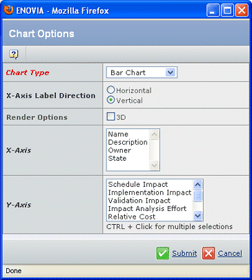
| Chart Type |
Select from the drop-down list: Bar Chart, Stacked Bar Chart, Pie Chart, and Line Chart.
A Stacked Bar Chart stacks multiple Y-Axis column values instead of drawing
them side-by-side as done in a simple Bar Chart. |
| 3D |
Check to render the chart with 3D effects. |
| For Bar Chart and Stacked Bar Chart |
| X-Axis |
Select the single non-numerical table column
to be used as the X-Axis in the chart. |
| Y-Axis |
Select one or more numeric columns
to be used as the Y-Axis in the chart. |
| X-Labels |
Select whether you want X-Axis field
labels drawn in a Horizontal direction or Vertical direction |
| For Pie Chart: |
| Slice Labels |
Select the non-numeric column to
be used as the heading for the pie chart. |
| Chart Data |
Select the numeric column you want
to be charted and drawn in slices. |
| For Line Chart: |
| X-Axis |
Select the single numeric column to be
used as the X-Axis in the chart. |
| Chart Data |
Select the numeric column you want
drawn in lines. To select multiples, press CTRL while clicking each name.
The pie chart will not display if you choose a column having one or more
negative values. |
| Y-Axis |
Select one or more numeric columns
to be used as the Y-Axis in the chart. To select multiples, press CTRL
while clicking each name |
Note:
If a numeric column is configured with units of measure, the units
stored in the database and those displayed in the table may be different.
For example, the database may store values in mm, and a table may display
them in cm. The chart always use the values and labels stored in the
database, not those displayed in the table. The legend and axis labels
show the default units.
Click Done.
The chart displays in a separate window.
If the table is not paginated, then the chart includes all objects.
If the table is paginated and no rows are checked, then the chart
includes all objects on that page only.
If specific objects are checked, then the chart is drawn based on
the selected objects only.
If the table contains no data, then clicking the icon gives an alert
saying that the chart cannot be drawn as there is no data in the table.
Note:
Pie charts cannot be drawn if the selected y-axis column values have
both positive and negative values. An alert is shown. The selected y-axis
column values must be either all positive or all negative.
The chart window stays open so you can change options and create multiple
charts.
 in the page toolbar
for a table with columns having numeric attributes. If the page toolbar
does not contain the chart tool, the chart option is not available for
that page.
in the page toolbar
for a table with columns having numeric attributes. If the page toolbar
does not contain the chart tool, the chart option is not available for
that page.