Configurable Toolbar | ||
| ||
Construction of a Configurable Toolbar
The configurable toolbar is configured using menus and commands. The toolbar supports an unlimited number of levels, but it is recommended that the number of levels be kept at 2 or 3.
The following image depicts one possible structure.
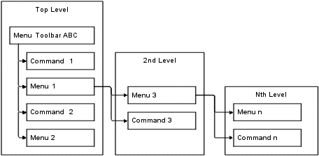
When the user clicks the top-level menu (Menu Toolbar ABC), the entire menu structure displays. Menu labels are not clickable, but the commands they include are. This setup allows the user to click once to open the menu structure, and then click one more time to select the needed option regardless of how many sub-menus are configured.
The top-Level section contains the toolbar menu and its connected menus and commands. The top-level menu, Menu Toolbar ABC in the above graphic, is an anchor for the toolbar structure. As such, it contains no settings. The connected menus and commands display as toolbar buttons on the top-level toolbar as shown below.

To display a standard link in the toolbar, one that does not contain a drop-down menu, you connect the command for the link to the top-level menu object. To display a drop-down menu on the toolbar, you connect the menu object for the drop-down menu, such as Menu 1, to the top-level menu object. Then connect the commands for the links within the drop-down menu to Menu 1.
Toolbar Linked to an Application
To use the configurable toolbar on a table, form, or portal page, the URL that calls the page needs to add the toolbar parameter.
toolbar=TOOLBARMENU
where TOOLBARMENU is the name of the toolbar menu. Below is an example URL that includes a toolbar on a table page:
${COMMON_DIR}/
emxTable.jsp?program=emxAEFCollection:getObjects&table=AEFColle
ctionItems&toolbar=AEFCollectionsToolBar&selection=multiple