Structure Browser Header | ||
| ||
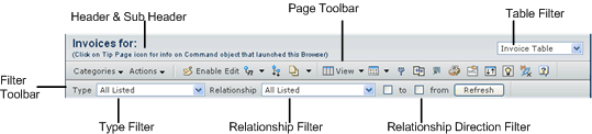
Header Display
The following figures shows the structure browser header section in view mode:
This table defines the header, sub header, and table filter:
| Field Name | Required | Editable | Description |
|---|---|---|---|
Header |
Yes |
No |
Header displays using the value passed in the URL parameter header. If the URL parameter header is not passed in, the system displays the default text defined in string resource key emxFramework.StructureNavigator.DefaultHeader as the heading. This key is assigned to the value: Structure View: $<type> $<name> |
Sub Header |
No |
No |
Sub Header displays using the value passed in the URL parameter subHeader It is ignored if the URL parameter subHeader is not passed in. |
List Filter |
No |
Yes |
The List Filter interface enables the user to change the program that expands the objects displayed in the structure browser. The system displays the option list for List Filter (in the header) only when the URL parameter expandProgramMenu is assigned to a menu and the menu contains more than one command. The system obtains the label displayed in the option list from the label in the command object. |
Table Filter |
No |
Yes |
The Table Filter interface enables the user to change the table view used in the structure browser. The option list for Table Filter is shown in the header only when the URL parameter tableMenu is assigned to a menu and the menu contains more than one command. The label displayed in the option list is obtained from the label in the command object. |
The following is a URL example for the header and Table Filter display:
common/
emxIndentedTable.jsp?header=emxEngineeringCentral.part.eBOM&sub
Header=emxEngineeringCentral.part.AllLevels&tableMenu=ENCEBOMVi
ews
Page Toolbar
The page toolbar in the structure browser header is the regular toolbar shown using the URL parameter toolbar. The structure browser adds a toolbar button Mode (after the Actions menu), if one is defined in the toolbar menu. If the structure browser displays non-object based data, Object Compare is not supported.
The following shows the page toolbar's default display:

You can include the generic delete command, AEFGenericDelete, as part of a toolbar or Actions menu in a toolbar. This command provides delete functionality for the table. In Edit mode, this command immediately deletes the selected nodes (after confirmation received from user), it does not mark the rows for deletion. You can also include the AEFGenericDeleteRMB command as part of a right-mouse-button menu.
| Action | Display | Mode | Description |
|---|---|---|---|
Actions <User defined toolbar menu> |
Actions menu |
icon and text |
Typically this menu is the Actions menu defined in the toolbar menu passed in as URL parameter toolbar. |
Mode |
toolbar button |
icon and text |
You can enable the Mode button by passing the editLink parameter as true (default value is false). If enabled, it displays just after the toolbar Actions menu. Clicking the Mode button enables the Edit menu and displays the structure browser list in edit mode. The menu configured using the editLink parameter does not support access control mechanisms such as Role, Access Mask, and so on. To configure the Mode button/menu with all access control, configure the toolbar command with an HREF value assigned to "javascript:editMode()". |
Edit |
toolbar command menu |
text and icon |
Clicking the arrow on the button pulls-down the menu. This menu/button is defined by the AEFSBEditActions menu. When the structure browser changes to edit mode, the pull-down menu is enabled. When the Mode button is clicked again, the Edit menu is disabled. |
Export to Excel |
toolbar |
icon only |
Opens the structured data as expanded in the format specified in the preference. |
Printer Friendly |
toolbar |
icon only |
Opens a printer friendly version of the current page. |
Object Compare |
toolbar |
icon only |
Opens the object compare wizard. |
Help |
toolbar |
icon only |
Opens a context-sensitive ENOVIA Help window. |
In addition, column sorting is disabled if there are any pending edits (user must Apply edits before sorting).
You can also define a custom toolbar filter as defined in Filter for a Structure Browser Page that displays beneath the page toolbar.
You can define separate toolbars for Edit and View mode of the structure browser using the Mode setting on the toolbar. When the Mode=view setting is defined for the toolbar, that toolbar only shows in View mode. When Mode=edit, that toolbar only shows in Edit mode. If the Mode setting is not defined, the toolbar shows in both Edit and View mode. See Menus and Toolbars for more details.
For example, this sample URL shows 3 toolbars being passed to the structure browser:
${COMMON_DIR}/emxIndentedTable.jsp?table=part_list
&program=myJPO:myFunc&relationship=myrelation&toolbar=toolbar1,
toolbar2,toolbar3&editLink=true
In this URL, toolbar1 could be set with Mode=view; toolbar2 with Mode=edit, and toolbar3 with no mode setting defined. In View mode, toolbar1 and toolbar3 are displayed; in Edit mode, toolbar2 and toolbar3 are displayed.
In addition, you can apply the Mode setting to submenus and commands within menus. In this case, the command is enabled or disabled depending on the current structure browser mode. For example, you can add the Mode=edit setting defined to a submenu for an existing menu. In View mode, the user can see but not access that submenu; in Edit mode, the user can access it.
ENOVIA Business Process Services Supported Actions
In addition to the Actions implemented specifically for the custom structure browser page, ENOVIA Business Process Services provides commands for Add To Selected and Remove Selected that can be included in an Actions menu. These commands are available to the user if one or more items are selected in the structure.
Add To Selected Actions Menu Command
For the Add To Selected command, you need to use a direct processing page or a custom search dialog (see Configurable Search Webform) to locate and connect the child objects.
The Add To Selected command uses the emxTableRowId parameter to send the Object Id, Rel Id and parent Object ID of the selected row to the custom implementation. If a custom processing page is used, it must return XML code using this XML message format:
<mxRoot>
<action><![CDATA[<%= action %>]]></action>
<message><![CDATA[<%= msg %>]]></message>
<data status="committed OR pending">
<item oid="1234.6354.3843.8237" relId="1234.6354.3843.8237"
direction="from" relType="relationship_EBOM">
<column name="Find Number">123</column>
    <column name="Description" actual="ActualValue">DisplayValue
    </column>
</item>
<item oid="5234.7354.6843.9237" relId="4134.8354.3682.1237"
direction="from" relType="relationship_SubstitutePart">
<column name="Find Number">234</column>
    <column name="Description" actual="ActualValue">DisplayValue
</column>
</item>
<item oid="8664.2343.7723.9823" relId="8234.5354.7843.4237"
direction="to" relType="relationship_AlternatePart">
<column name="Find Number">567</column>
    <column name="Description" actual="ActualValue">DisplayValue
</column>
</item>
</data>
</mxRoot>
In this XML message:
- The value of the <action> element should be set to add.
- If the value of the <message> element contains a string, that string is shown as an alert to the user.
- The <data status> attribute can be "committed" or "pending". If the processing page made the connection, use committed. If the processing page did not make a connection, use pending and the connection will be made when the user clicks the Apply button.
- The direction element indicates the direction of the relationship (to or from) between parent and child objects. If not specified, the direction is not shown to the user.
- The <item> element contains the objectId and the relId for the added objects. If the data status is pending, it contains only the objectId. If the data status is committed, both the objectId and relId are required.
- If <relType> is sent, it will be processed and will be available in the markup if the user saves the edits as a markup.
If using a custom search dialog: When the user clicks Done after selecting one or more objects from the result set, the custom code should call the editableTable.addToSelected(String XML) function to refresh the structure browser page. If the user had selected multiple rows, the returned node(s) are added to all of the selected nodes.
When the Add To Selected functionality receives the XML message with
an add action, it performs these steps:
- Calls the database to retrieve the table column values for the returned nodes.
- If not already expanded, expands the structure browser by one level to show the added node, unless the node would not be shown based on any filter selections in the header.
- Rebuilds the view of the structure browser.
You can only use this option to add a child node to a selected node; you cannot use it to add a root node to the structure.
If viewing the structure browser in flat table mode, the Add To option cannot be used.
Remove Selected Actions Menu Command
You configure the Remove Selected functionality the same way as the Add To Selected feature, except the return action listed in the XML message is remove and there is no need for a data section.
<mxRoot>
<action><![CDATA[<%= remove %>]]></action>
<message><![CDATA[
<%= msg %>
]]></message>
</mxRoot>
The Target Location setting is set to listHidden for the command to support existing HTML/JavaScript controls such as popups and messages. New implementations do not need to use the target location for processing and should encapsulate the response (message) in the mxRoot XML structure.
Filter Toolbar
The filter toolbar contains the type filter and relationship filter elements to provide a filtering interface based on relationships, types and the relationship direction.

The following table provides the details of the elements displayed in filter toolbar.
| Field Name | Required | Editable | Description |
|---|---|---|---|
Type |
No |
Yes |
Enables users to filter the list of expanded objects based on the selected type available in the option list. The type filter control displays only when you explicitly pass the URL parameter typeFilter assigned to true. When the typeFilter parameter is passed in as true: The list of types passed in using the parameter type displays in the combo box, with an additional option "All Listed Types" selected by default. If you pass the type parameter as "all", then the combo box lists all the types in the system, along with the additional option "All", selected by default. |
Relationship |
No |
Yes |
The relationship filter allows the user to filter the list of expanded objects based on the selected relationship. The relationship filter control displays only when you explicitly pass the URL parameter relationshipFilter assigned to true. When you pass the relationshipFilter parameter as true: The list of relationships passed on the relationship parameter displays in the combo box, with an additional option "All Listed Relationships" selected by default. If you pass the relationship parameter as "all", the combo box displays all the relationships in the system, including an additional option "All", selected by default. |
To From |
No |
Yes |
The direction filter allows the user to filter the list of expanded objects based on the direction of relationship. The direction filter control displays only when you explicitly pass the URL parameter directionFilter assigned to true. When you pass the directionFilter parameter as true: The direction parameter value determines the check box "To" or "From." If you do not pass in the direction parameter or pass it as "all", the check boxes for both "From" and "To" are checked. |
Refresh |
No |
No |
Refreshes the structure browser list based on the current selection in the type filter and relationship filter. |