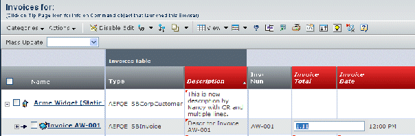
In-cell Editing | ||
| ||
Input Controls for In-cell Edit
When the user clicks on any editable field, a popup layer displays with the input field using one of these input controls (defined by the Input Type setting):
- textbox--This is the default. The column has a single-line box for typing text.
- textarea--The column has a multi-line box for typing text.
- radiobutton--Shows a radio button next to each range value
- checkbox--Shows a checkbox next to each range value.
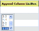
- listbox--Provides a list of range values and users can select a single value. Users can select multiple values, but only one value is saved. If you implement a custom JPO, users can select multiple values and those values are saved as a comma-separated list.
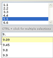
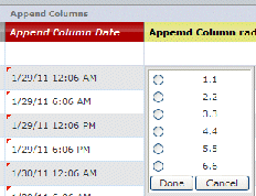
- listboxmanual-- Provides a list of range values and users can select a single value as above, and also allows the user to manually type a value.
- combobox--The column has a drop-down list of options and users can only select one value.
When the user clicks outside the edit field, the original cell reflects the changes, again with a visual cue that allows the user to see ongoing edits.
Textarea Input Control
This figure shows in-cell editing of a column with setting Input Type=textarea.
If enabled, Dynamic URLs and mxLinks can be entered into text fields. See Dynamic URLs and mxLinks for a Column for details.
If a user edits a cell, the framework validates the mxLink when the user exits the cell and displays an error message to the user.
When using the Mass Update toolbar, the framework validates the mxLink when the user clicks Apply to Selected or Apply to All in the toolbar and displays an error message to the user. For the mxLink errors using Mass Update, the user has the option to save with the errors, or to cancel and fix the problem.
Combobox Input Control
The following shows in-cell editing of a column with setting Input Type=combo box.
Radiobutton Input Control
The following shows in-cell editing of a column with setting Input Type=radiobutton. You can also provide a value for the Input Control Direction setting to define whether the values show horizontally or vertically (default).
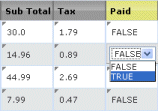
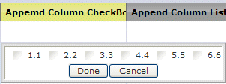
Checkbox and Boolean Input Control
The following shows in-cell editing of a column with setting Input Type=checkbox. You can also provide a value for the Input Control Direction setting to define whether the values show horizontally or vertically (default).
For fields (shown as columns) that have boolean values, a single checkbox shows in the Edit mode for that cell. The field is considered to be boolean if:
- The expression for the object or relationship resolves to an attribute of type Boolean.
- The expression for the object or relationship resolves to an attribute of type String that contains two ranges values specified in the emxFramework.UIFreezePane.Checkbox.BooleanValues property (see emxSystem.properties for details).
- A Range Program and Range Function setting evaluates to two range values listed in the above-specified property.