Viewing Metric Visuals for a Project | ||
| ||
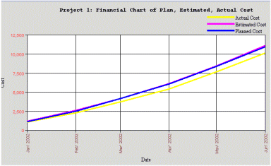
Financial Line Graphs
Two line graphs are shown. The first shows the actual cost of the project, the estimated cost, and the planned costs. The second shows the actual benefits of the project, the estimated benefits, and the planned benefits.

![]()
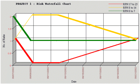
Waterfall Chart
A Waterfall chart can give you an insight for project risk reduction. The objective of this graph is to show the number and category of risks/issues associated with the project over time. Typically this graph is a bar chart, with increased risks/issues of a particular RPN color code going "up" the waterfall and then decreased risks/issues of a particular RPN color code going back "down" the waterfall. The Create RPN Waterfall graph feature lets you create an RPN Waterfall. The X axis (time) represents the effective date of the RPN and the Y axis (number of risks) represent the number of risks associated with the search results.


