URL Parameters Accepted by emxTable.jsp and emxTableEdit.jsp | ||
| ||
| Parameter | Description | Accepted Input Values |
|---|---|---|
The name of the table that defines columns that you want to include in the table being defined. |
||
autoFilter |
Determines whether the filter tool |
true (default)--The Filter tool displays in the page toolbar. false--The Filer tool does not display in the page toolbar. |
(view mode only) |
Displays the Cancel link in the table footer frame. When a user clicks Cancel, the whole browser window closes. You can only use the Cancel link for a table page opened in new window. You can configure the label for the Cancel link using the CancelLabel parameter. If you do not pass the CancelLabel, the default label "Cancel" is used. |
true--Shows the Cancel link. Use only for tables displayed in popup windows. false (Default)--Does not show the link. |
(view mode only) |
Defines the label for the Cancel link, if you want something other than "Cancel". |
Any static text or string resource id. CancelLabel=emxEngineeringCentral.Common.Cancel |
(view mode only) |
Specifies whether the chart options icon displays in the table toolbar. |
true (default)--Show the chart options icon in the table toolbar if the table has one or more numerical columns. No icon is shown if the table does not have any numerical columns. false--Do not show the chart options icon in the table toolbar, even if the table has numerical columns. |
customize |
Enables (true) or disables (false) the ability for users to create customized versions of the page. This parameter overrides the emxFramework.UITable.Customization system property, and has no effect on other table or structure browser pages. If not provided, the value specified for emxFramework.UITable.Customization is used. All access controls defined for the system table are retained in the customized table. If a column does not have a label or alt value defined (and is not a file, checkbox, icon, image, or separator), the column name shows in the user's selection list, however, this name cannot be internationalized. |
true false |
(view mode only) |
In the table component, by default all the columns are sortable, unless a column has a setting 'Sortable = false'. If the user clicks on the header of the sortable column, then the objects are sorted based on that column. To prevent users from sorting columns, pass the parameter 'disableSorting=true' to emxTable.jsp. |
true false (default) |
(view mode only) |
Use to display the Edit toolbar item on the table page. The Edit link is automatically configured to call the editable version of the current table using emxTableEdit.jsp. |
true false (default) |
(view mode only) |
Shows or hides the Export If a column includes an attribute configured with a dimension, the exported data shows the value/units as displayed in the table, not the normalized values. If the user chooses CSV or Text for their export format, the export does not include Icon column type and programHTMLOutput columns. To get the column values exported when the column type is "programHTMLOutput," you must also set "Export= true" for the column. |
true (Default)--The Export tool displays, allowing users to export the table data. false--The tool does not display. |
(view mode only) |
Specifies the name of the JSP used in the custom filter frame (between the header and body). You can use the directory macros to refer to the location of the page. The path of the page is relative from the ematrix/common directory. For details on implementing the custom filter, see Implementing a Custom Filter. |
${SUITE_DIR}/emxTeamProjectTableFilter.jsp? ${ROOT_DIR}/emxPartECOSatusFiletr.jsp? ${COMMON_DIR}/emxCommonStateFilter.jsp? emxCommonStateFilter.jsp |
(view mode only) |
Controls the size of the filter frame in pixels. The value should be at least 40 (the default). |
40 (default) 80 160 |
When true, show the mxLink icon/command button on the toolbar, which opens a search dialog box. |
true (default) false |
|
The content of the heading that appears at the top of the table page. |
Any alphanumeric text or a string resource ID. header=Buyer Desk header=emxQuoteCentral.AssignedPackages.AssignedPackages |
|
Specifies how often the header row should repeat. A repeating header row makes it easier for users to identify the content of each column when scrolling through a long table. If the parameter is not used, the header row repeats every 15 rows (or whatever number is assigned to emxNavigator.UITable.HeaderRepeat in emxSystem.properties. |
Any positive integer. Default is 15. For example, 11 would mean the header row is repeated every 11 rows. To turn off headerRepeat, pass in 0 as the value for the parameter. |
|
Specifies the name of the help marker to call for context-sensitive help. |
String The naming convention for help markers "emxhelp" followed by the object or feature and then the action, for example, emxhelproutecreate and emxhelpprojectedit. The marker is all lowercase with no spaces. |
|
Used when there is no program parameter passed in to emxTable.jsp or emxTableEdit.jsp. Specifies the inquiry administrative object to retrieve the business objects to include in the table and any inquiries for the table page filter list. The emxTable.jsp uses the first inquiry object to display the list in the table on page load. It uses all inquiry objects for the table filter list in the header. emxTableEdit.jsp does not support multiple inquiries. If multiple inquiries are passed with the ',' separator, only the first one is used. It ignores the rest. If there is only one inquiry, the filter list in the header is not displayed. To build the filter list, you must use either JPOs or Inquiry objects. You cannot use both. |
For emxTable.jsp, Names of inquiry administrative objects separated by commas. Only one inquiry is allowed for emxTableEdit.jsp. inquiry=SCSBuyerDesk,SCSBuyerDeskAssigned inquiry=ENCAllParts, ENCReleasedParts |
|
(view mode only) |
Used with the "inquiry" parameter. Specifies the labels for each inquiry in the filter list in the table page header. Each label is associated to the corresponding inquiry administrative object name specified in the "inquiry" parameter. The label may have the actual text or the string resource id for internationalization. |
One or more labels (equal to the number of objects specified in the "inquiry" parameter) for the inquiry administrative object names separated by a comma. inquiryLabel=All,Assigned inquiryLabel= emxEngineeringCentral.Common.All, emxEngineeringCentral.Common.Released |
Allows session data to be passed to a JPO and uses the format: scope:attributeName where scope can be one of these values: application session request and the attribute must be a valid attribute used within the specified scope. The parameter can pass a comma-separated list of scope:attributeName values. The attribute values must be serializable. |
application:<attributeName>,session:<attributeName>,request:<attributeName> |
|
(view mode only) |
When the user clicks the Launch button (from a channel tab), the system passes launched=true to the new popup page. It indicates that the popup is a result of clicking the Launch button. You can change the behavior of the popup page from the normal mode pages using this parameter. In normal mode, pages will not include the launched parameter and default to launched=false. |
true false (default) |
Overrides the system property emxFramework.Lifecycle.MassPromoteDemote.Enable for the specific page. The default value for this parameter is the value for the above property. The page must also include the State and Type columns. See emxSystem.properties for details on setting property values that control the mass promote/demote feature. |
true false |
|
(edit mode only) |
Use to turn on or off mass update controls on the editable table page. |
true (default)--Mass update is available for the page. false--Mass update not is available for the page. |
Enables or disables multiple column sorting on a page. If disabled, the user can still sort by a single column if one is specified in the sortColumnName parameter. When set to false, multiple column sorting is also disabled in any custom tables users' create based on this system table. |
true (default) false |
|
(view mode only) |
Use to configure a table page to list items other than business objects. For example, the items such as collections and IconMail messages are not business objects you can list them in a table by passing the URL parameter objectBased=false. When you set objectBased to false, the parameter objectCompare is assumed to be false and the object compare icon does not display. When you set objectBased to false, the JPO that gets the list should follow the same guidelines used for getting the object list. See JPO Guidelines for Getting Object List. Assign the MapList containing the HashMaps with key name "id" to the row identifier value and not the "objectId." The value assigned to "id" is the row identifier for every row in the table. If the table has a check box column (named emxTableRowId), the check box value is assigned "id" value. |
true (default)--The table page lists only business objects. false--The table page lists items that are not business objects. |
(view mode only) |
Use to display or hide the object compare icon. When a column contains an attribute configured with a dimension, the comparison is done based on the normalized value, not the displayed value. When
either of the following conditions apply, this parameter is assumed to
be false and the object compare icon does not display:
|
true (default)--The object compare icon is displayed. false--The object compare icon is not displayed. |
(view mode only) |
Specifies the number of rows to show per page. If the rows span more than one page, users can use the Left and Right Arrow buttons or the Page drop-down list to navigate to other pages. For more information on pagination controls, see Table Pagination Controls. If you do not specify this parameter, the system uses the value set in the pagination property in emxSystem.properties. When installed, this property is set to 10 rows per page. If 0 is specified, all objects are listed on one page. |
Any number. Use 0 if you do not want to paginate. If 0 is specified, the pagination controls do not include the controls for navigation. |
(view mode only) |
Every page configured inside the PowerView includes the parameter portalMode=true, so that the page can differentiate between normal display and portal display. Clicking the Launch button, launches the currently displayed channel tab into a maximized popup window, passing the parameters launched=true and portalMode=false to the new window. |
true false (default) |
(view mode only) |
Specifies the alternate table to use within a channel tab. Displaying table component listings in half page-width channels, typically cause the user to scroll horizontally to view all columns. However, you can create an alternate table with fewer columns for display specifically within a channel tab. For example, if a standard ECO New Parts table contains 10 columns, you could define an alternate ECO New Parts table containing 4 columns. |
Name of alternate table |
(view mode only) |
Specifies whether the table page includes the Printer Friendly tool. You can have the system pass this parameter automatically by entering the Printer Friendly setting for the command object that calls the table page. |
true (default) false |
Used only when there you do not pass the inquiry parameter to emxTable.jsp or emxTableEdit.jsp. This parameter provides an alternative to the inquiry object. The program approach uses a JPO program object to fetch the object list to display. For emxTable.jsp, the parameter value can have one or more sets of values separated by a comma ",". The emxTableEdit.jsp does not support multiple program parameters. If you pass multiple programs with the ',' separator, it uses only the first and ignores the rest. emxTable.jsp uses the first set of values (JPO name and method name) to display the list when the page is first loaded. It uses all the sets for the table filter list in the header. If there is one program, the filter in the header does not display. To build the filter list, use either JPOs or Inquiry objects. You cannot use both. |
This parameter is assigned to one (or more in view mode) set of values that will form a JPO program name and the method name. The format of the parameter value is: program=<JPO program name>:<JPO method name> The program name and the method name are separated by a colon ":". program=emxTableBuyerDesk:getBuyerDesk,emxTableBuyerDesk:getAssignedBuyerDesk For guidelines on writing a JPO for getting a list of business objects, see JPO Guidelines for Getting Object List. For a sample of a JPO that gets a list of business objects, see Sample JPO for Getting List of Objects. |
|
(view mode only) |
Use with the parameter "program" defined above. Specifies the labels for each program in the filter list in the table page header. You can assign one or more labels (equal to number of "program" values) separated by a comma ",". Each label is associated to the corresponding JPO object and method name specified in "program" parameter. The label can contain the actual text or the string resource id for internationalization. |
programLabel =All,Assigned programLabel = emxEngineeringCentral.Common.All, emxEngineeringCentral.Common.Released |
(view mode only) |
Controls whether the system remembers the items a user selects on one page when the user navigates to another page in the table. The emxSystem.properties key emxNavigator.UITable.Pagination.RememberSelection sets the default for table pages. Use this parameter to override the default for a single page. For more information, see About Tables. |
true--Selected items are remembered across the table's pages. false--Selected items are not remembered across pages. |
(view mode only) |
Controls whether the table page adds a column of check boxes or radio buttons in the left-most column of the table. When this parameter is set to single or none, the parameter objectCompare is assumed to be false and the object compare icon does not display. |
multiple--Users can select more than one row in the table, and the system displays a check box in the left column of each row. There are no access restrictions for the check boxes. If you pass this parameter, it overrides any check box column added to the table administrative object. For more information, see Column Values as Check Boxes. single--Users can select one row in the table. A radio button displays in the left column of each row. none--A selection column is not added to the table page. (You can still display a check box column by adding the column to the table administrative object.) |
This menu is enabled by default and adds the
If the user clicks Set the value for this parameter to false to disable this feature. For File Summary Pages for ENOVIA products, the default value for this parameter is false. |
true (default) false |
|
When true, The default value for this parameter is defined by the emxFramework.Toolbar.ShowPageURLIcon property in emxSystem.properties. |
true false |
|
Enables or disables the right-click menus on the page. When set to false, all right-click menus for that page are disabled. |
true (default) false |
|
Applies only in Portal mode (when the page is displayed within a PowerView), enables or disables the page header. If false, the header text is not displayed in the PowerView tab. If true, the header text shows in the tab. |
true false (default) |
|
Specifies the sort columns when the page first loads. If no column is specified, the rows display in the order they are retrieved from the database. Can be a comma-separated list of up to 3 column names. The page sorts by the first provided column, then by the second, then by the third. Used as the default Sort by settings in the Customize Table View dialog box. Columns defined with sortType=other setting cannot be used with multiColumnSort. |
Name of table column. column1,column2,column3 |
|
Defines the sort order for the columns specified in the sortColumnName parameter. If a single value is passed, it applies to all columns, or you can pass a comma-separated list of values matching the number of columns in the sortColumnName parameter. Used as the default sort directions in the Customize Table View dialog box. |
ascending (default)--Sort a to z or 0 to n. descending--Sort z to a or n to 0. ascending,descending,ascending |
|
After opening the Edit view of a table, the value for this parameter determines if the the View mode of the table is refreshed based on the user edits. When true, the table is refreshed; when false, it is not refreshed. |
true (default) false |
|
(view mode only) |
Determines the cascading style sheet that defines the layout and color for headers and footers on the table page or popup dialog. If the style parameter is not specified, the system uses the list style from the default style sheet. To use a different style sheet, change the following property in emxSystem.properties: emxNavigator.UITable.Style.List = styles/emxUIList.css If you specify style = dialog, the system uses the deault style sheet. To use a different style sheet, change the following property in emxSystem.properties: emxNavigator.UITable.Style.Dialog = styles/emxUISearch.css If you specify style = PrinterFriendly, the system uses the default sheet. This is hard-coded into the emxTableReportView.jsp page (the page that displays the printer-friendly page). |
list (default)--Use for table pages displayed in the content frame of emxNavigator.jsp. dialog--Use for table pages displayed in popup windows, such as search result pages. PrinterFriendly--Use for displaying a page in printer-friendly mode directly from a command link, instead of the Printer Friendly icon in a list page. |
Creates a subHeader below the main header in the table header frame.
|
The value can be static text or a string resource id. For example: subHeader= emxEngineeringCentral.Common.BOMLevel subHeader=Bill of Material Level 1 The value can also include macros such as $<type> $<revision>. |
|
(view mode only) |
Displays the Submit link in the table footer frame. The value can be a valid JSP page that executes when the user clicks Submit. You can configure the label for the Submit link using the SubmitLabel parameter. If SubmitLabel is not passed, the system uses the default label "Submit". |
Any JSP. The path can include any directory macro. SubmitURL=${SUITE_DIR}/emxBlank.jsp |
(view mode only) |
Defines the label for the Submit link. |
Any static text or string resource id. SubmitLabel=emxEngineeringCentral.Button.Next |
Specifies the table object for presenting this targeted page. In view mode, the table object has all the information needed to display the table, including the columns to present. You must use the actual table name; this parameter does not support symbolic names. |
Name of table administrative object. For example: table=SCSBuyerDesk table=ENCParts |
|
| tableType | If the emxFramework.Table.Type property in emxSystem.properties is set to new, this URL property overrides that setting. The only accepted value is classic. See Table-to-Structure Browser Conversion for details. | classic |
| targetLocation | When a URL is defined to open in the slide-in frame (the Target Location setting for the component is set to slidein), ENOVIA Business Process Services appends this URL parameter with this value. This parameter supports a custom page where the html for a popup window needs to be different than the html for a slide-in window. | slidein |
(view mode only) |
Specifies whether the table page should include the Tip Page tool and call a specific html or jsp when a user clicks the tool. If this setting is not included, the Tip tool is not included on the table page. |
Name of a custom html or JSP page, including any path. The starting point for the directory reference is the content directory. For example, to call an html file in ematrix/doc/customcentral and the content directory is ematrix/customcentral, you would add this parameter to the table.jsp: TipPage=../doc/customcentral/tippage.html |
Defines the name of the toolbar menu to show on the table page. You can pass this to either emxTable.jsp or emxTableEdit.jsp. To use the same toolbar in both a view mode and an editable table, pass the same toolbar name to each. You show the Edit button in the Table component by passing the parameter editLink = true to emxTable.jsp, then passing the editToolbar parameter to emxTable.jsp. If the Edit button in the Table component is a custom command where the URL is a custom URL (for example emxTableEdit.jsp), then the parameter should be appended to the custom URL (emxTableEdit.jsp). |
Name of the toolbar: toolbar=SCSBuyerDesktoolbar |
|
Controls whether the table query executes within an Update transaction or Read transaction. Use the Update transaction whenever the code needs to update the database while fetching the object list. |
read (default)--The table query does not execute within an Update transaction. update--The table query (inquiry or JPO) executes within an Update transaction. |
 displays in the toolbar, and overrides the Auto Filter
setting on a table or structure browser column.
displays in the toolbar, and overrides the Auto Filter
setting on a table or structure browser column. tool on the page toolbar. When users click the tool,
the system exports the table data to a file in the user's preferred format
in their preferred format: CSV, HTML, or Text. Users choose their preferred
format using the Preferences tool in the global toolbar. For information
on configuring the export preference, see
tool on the page toolbar. When users click the tool,
the system exports the table data to a file in the user's preferred format
in their preferred format: CSV, HTML, or Text. Users choose their preferred
format using the Preferences tool in the global toolbar. For information
on configuring the export preference, see  to the page toolbar. The icon acts as a pull-down menu:
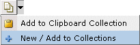
 shows in the toolbar. This tool lets users copy the
URL to the specific
shows in the toolbar. This tool lets users copy the
URL to the specific 