Settings for Columns in a Structure Browser | ||
| ||
| Setting | Description | Accepted Values/Examples |
|---|---|---|
Controls access to the column based on a valid expression. The system evaluates the expression at runtime. If the expression evaluates to True and no other access control prevents access, the component is shown. Depending on the type of expression defined, the program may or may not need a valid objectID. Make sure that an objectID is available before configuring this setting for configurable toolbar menus and commands. Access Expression is not supported for non-object based structure browsers. |
|
|
The name of the JPO method to invoke in the JPO specified for the Access Program setting. The Access function gets the input parameter as a HashMap that contains all the request parameters passed into the JSP page. The JPO method must return a Boolean object. If the returned value is true and no other access control prevents access, the component displays. If false, it is hidden. To see a sample JPO method to control access, see Sample JPO for Controlling Access. Use this setting to evaluate access independent of users' roles. |
The name of an access check method in the JPO specified in the Access Program setting, such as: emxAccessCheck() |
|
Specifies the accesses the user must have for the current business object for the column to display. When you use the setting for commands in page toolbars, menus, trees, table columns, and form fields, the system evaluates the access mask on a specific business object. This business object is available only when the objectId is passed in as a URL parameter to the JSP. Make sure that an objectId is available before configuring this setting for configurable toolbar menus and commands. If the user does not have all the specified accesses in the business object's policy for the current state, the system hides the component. If the user has the access and no other access control prevents access, the system displays the component. You can specify multiple accesses by separating the accesses with a comma. Access Mask is not supported for non-object based structure browsers. |
Any set of accesses, separated by a comma. For example: Modify Delete ToConnect ToDisconnect FromConnect FromDisconnect Modify,Delete FromConnect,FromDisconnect |
|
Controls access to the column based on the output from a method in the specified JPO program. You must define the program in Business Modeler. This setting requires that you also specify the Access Function setting. If Access Function is not set, the system ignores the Access Program setting. The following input values are required for the program:
The output must be a Boolean. |
Name of a JPO defined as a program object, such as: emxAEFCollectionAccess |
|
| Add Input Type | Defines the input control used with the insert new row functionality when the structure browser is in edit mode. |
|
Use to translate columns whose values are administrative types. The value is translated and presented. For attributes, provide the symbolic name of the attribute. Symbolic names start with "attribute_" and are followed by the attribute name with no spaces. Not supported for non-object based structure browsers. |
Type State Role Relationship attribute_UnitOfMeasure |
|
When true, users can manually edit the table column. Applicable only when you set the range parameter to a URL or when you assign the setting format to date or for fields of type combobox. The system ignores all other cases. When true, the system ignores the Admin Type setting. Not supported for non-object based structure browsers. |
false (default)--Manual entry is not allowed. true--Manual entry is allowed. |
|
By default, when a column's data is configured to show as a hyperlink using the href parameter, the system passes the ID of the object for that row in the objectId parameter. Using this setting, you can configure the hyperlink so a different objectId is passed. The system passes the ID for the object returned from the expression defined in this setting. Not supported for non-object based structure browsers. |
$<to[relationship_NewPartPartRevision].from.id> $<to[relationship_EBOM].from.id> For more information on configuring a column using an alternate object ID's expression, see Column Values Using Alternate OID in href and Select Expression and Column Values Using Alternate OID and Type Icon in href with Select Expression. |
|
This setting is required to display the state of any connected objects and show the value translated. This setting is applicable only when the Admin Type setting is set to State. Not supported for non-object based structure browsers. |
Any select expression that evaluates to a policy of a connected object. |
|
When the Show Alternate Icon setting is true, this expression is used to obtain the object type. Based on the obtained type, the corresponding icon is displayed. For more information on configuring a column using an alternate type expression, see Column Values Using Alternate OID in href and Select Expression. Not supported for non-object based structure browsers. |
$<to[relationship_NewPartPartRevision].from.type> $<to[relationship_EBOM].from.type> |
|
Comma-separated list of arithmetic expressions. Expressions can include cell variables. |
||
Determines whether users can filter the structure browser
rows based on data in the column. If at least one column in the table
is capable of autofiltering, the Filter If passed, the autoFilter URL Parameter overrides this setting. Filtering applies to root level objects only. |
true (default)--The Filter tool displays in the page toolbar. When clicked, the column is available on the Auto Filter Selection page. false--The column is not available in the Auto Filter Selection page. |
|
| autoNumber | Used for Name columns in an editable structure browser. When autonaming is used for objects, this setting allows the user to choose the auto number series. The value for this setting is the symbolic name for the type. | autoNumber=type_HardwarePart |
When true, calculates the average of values in the column, using the defined decimal precision. By default, the calculation uses the system-wide precision (set in emxSystem.properties), or you can use the Decimal Precision setting to set a specific precision for this column calculation. |
true false (default) |
|
When the Calculate Average setting is used, any value for this setting shows as the label for the column average. If not defined, "Average" is used as the label. |
Average (default) <any string value> |
|
When true, invokes the program defined by the Calculate Custom Program setting. |
true false (default) |
|
When the Calculate Custom and Calculate Custom Program settings are used, any value for this setting shows as the label for that calculated value. If not defined, "Custom Label" is used as the label. |
Custom Label (default) <any string value> |
|
If the Calculate Custom setting is true, this setting defines the program and function to invoke. The program can perform any calculations needed for the data in the column, with a single result. |
program:function |
|
When true, displays the largest value of the column values. |
true false (default) |
|
When the Calculate Maximum setting is used, any value for this setting shows as the label for the column maximum. If not defined, "Maximum" is used as the label. |
Maximum (default) <any string value> |
|
When true, displays the middle value (the mean) of the column values. If the column contains in an even number of values, the average of the 2 middle numbers is used, using the defined Decimal Precision. By default, the calculation uses the system-wide precision (set in emxSystem.properties), or you can use the Decimal Precision setting to set a specific precision for this column calculation. |
true false (default) |
|
When the Calculate Median setting is used, any value for this setting shows as the label for the column median. If not defined, "Median" is used as the label. |
Median (default) <any string value> |
|
When true, displays the smallest value of the column values. |
true false (default) |
|
When the Calculate Minimum setting is used, any value for this setting shows as the label for the column minimum. If not defined, "Minimum" is used as the label. |
Minimum (default) <any string value> |
|
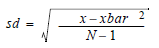
When true, displays the standard deviation of the column values using this formula:
where: N=total number of elements xbar=mean of the column values By default, the calculation uses the system-wide decimal precision (set in emxSystem.properties), or you can use the Decimal Precision setting to set a specific precision for this column calculation. |
true false (default) |
|
When the Calculate Standard Deviation setting is used, any value for this setting shows as the label for the column calculated value. If not defined, "Standard Deviation" is used as the label. |
Standard Deviation (default) <any string value> |
|
When true, displays the total of the column's values. |
true false (default) |
|
When the Calculate Sum setting is used, any value for this setting shows as the label for the column sum. If not defined, "Total" is used as the label. |
Total (default) <any string value> |
|
Use to specify the name of the method in the JPO specified in the Calendar Program setting that retrieves the non-working days based on the calendar defined for the location. |
The name of a function in the Calendar Program JPO, such as: getNonWorkingDays |
|
Use to specify the name of a JPO that contains a method to get the non-working days for a calendar. |
The name of a JPO, such as: emxWorkCalendar |
|
Use to display an icon for the column's data instead of other data. Required when the setting "Column Type" is assigned to "icon". Also see Column Values as Icons. Not supported for non-object based structure browsers. |
Name of an image file such as: images/NewWindow.gif images/EditItem.gif |
|
The setting "Column Type" is used when no expression is defined for the column data. For recommendations on improving the performance of table columns whose data is generated with a JPO program (Column Type set to program or programHTMLOutput), see Improving Performance of Table Columns. If using programHTMLOutput to populate a column with an image or icon, make sure to include a height attribute to prevent column/row misalignments, for example: <img src="images/iconSmallDefault.gif" border="0" height="16"></img> For non-object based structure browsers, only these column types can be used: program progarmHTMLOutput separator |
program--The values for this column are obtained from a program (JPO). With this setting, the program and function name are required as settings. For more information on configuring a column using a program, see Column Values as Select Expressions. programHTMLOutput--Same as the "program" setting above, except the column value output is in HTML format. Column values are placed in the table cell between <td> and </td> tags. This setting ignores other column settings such as Show Type Icon, href, format, and Alternate OID expression. icon--Used when the column values are shown as an icon. The setting "Column Icon" must be defined with the icon to be displayed. For more information on configuring a column using a program, see Column Values as Icons. checkbox--Used when the column values are check boxes shown grayed or not-grayed based on the access to the object in that row. This access can be based on business logic and defined in a JPO or it can be role-based and defined by assigning roles to the column. If the check boxes have no access restrictions, this setting is not required and you can create check boxes by passing in the parameter selection=multiple to emxIndentedTable.jsp. Also see Check Box. separator--Used to define a column of white space between standard data columns. A separator is especially useful to separate two groups of columns. file--Shows which hyperlinks to a Quick File Access page listing files checked into or connected to the object. The optional Relationship Filter setting defines how to locate related files. image--Used when the column values are images. When used, the column shows the small version of the primary image associated with the business object. |
|
When the structure browser includes a structure compare feature, this setting allows you to include (true), or exclude (false) the column from the list of columns a user can select to Compare By. |
false true (default) |
|
When the structure browser includes a structure compare feature, this setting allows you to show or hide the column from the report results. |
hide show (default) |
|
| Decimal Format | Defines the decimal precision (number of digits after the decimal point) for displaying values in numeric columns. | 5 2 |
Defines the decimal precision for all calculations for this column. The system properties setting emxFramework.SBTableCalculations.DecimalPrecision defines the system-wide value; this setting overrides that value. You only need to use this setting if you want to use a value other than the system-wide value (defined in emxSystem.properties). |
Any positive integer. |
|
| Default Function | Specifies a JPO used to populate the default value when using the add existing row functionality. | JPO name |
| Default Program | Specifies the method within the JPO specified by the Default Program setting. | method name in the JPO |
When multiple columns in a structure compare Complete Summary Report have different values, this setting defines what to show in the Diff Code column. The code value for the column with the lowest precedence shows in the Diff Code column. Multiple columns can have the same precedence, and if both columns have different values, both code values show in the Diff Code column. |
<precedence:code value> 1:Attribute |
|
Specifies the date format for any column where the value of the format setting is "date." See Date/Time Fields in Forms and Tables. Not supported for non-object based structure browsers. |
These are Java standard values of Date Format to display a date in a specific format. 3 - SHORT (12/12/52) 2 - MEDIUM (Dec 12, 1952) 1 - LONG (December 12, 1952) 0 - FULL (Tuesday, December 12 1952 AD) Set the default in emxSystem.properties: emxFramework.DateTime.DisplayFormat=MEDIUM. emxSystem.properties uses words, but the Display Format setting uses numbers. |
|
Display Time |
Controls whether the time is displayed along with the date for columns whose format is set to date. If no time zone preference is set, then the DateTime is shown in the browser's time zone. The time is shown in terms of GMT+/- hh:mm, (e.g., Saturday, August 21, 2004 12:45:00 PM GMT-04:00). To get the time in a format like EST or PDT, set the time zone preference to a specific zone. See Date/Time Fields in Forms and Tables. Not supported for non-object based structure browsers. |
true false Default is set in emxSystem.properties for the property emxFramework.DateTime.DisplayTime = false |
| Display View | When the column has the setting Display View=thumbnail defined, the data in this column displays beneath the thumbnail when the structure browser is shown in Thumbnail View. The number of lines of text shown beneath the thumbnail is controlled by the emxFramework.ThumbnailView.fieldcount property in emxSystem.properties. If the number of columns with Display View=thumbnail defined exceeds 3, then only the data for the first 3 columns with the Display View=thumbnail setting are shown beneath the thumbnail. If the number of columns with the setting is less than the property's value, then only those columns defined with the setting are shown. If this setting is not defined, then the structure browser displays the first 3 columns in the thumbnail view. |
thumbnail |
Defines in which mode, Edit or View or Both, that this column is visible. When used, the visibility of the column is defined by the current mode and the value of this setting instead of an Access Expression. For example, if the structure browser is in view mode and this setting is Edit, then the column is not visible. This setting applies to columns used in the structure browser only; it does not work for columns in flat tables (emxTable.jsp). |
Edit View Both (default) |
|
Dynamic URL |
When enabled, users can enter URLs or mxLink values and the values will display and function as hyperlinks. |
enable (default) disable |
Defines the method in the JPO specified by the Edit Access Program setting that determines access for each cell in the column. The method returns a StringList of boolean values for each cell (true/false) defining the edit access to that cell. |
JPO method name |
|
Edit Access Mask |
Controls cell-level access in an editable table. The access check is done on all objects in one database call along with getting the column values. If any cell does not have the specified access, then the cell displays as read only. |
Any access mask, for example: modify, connect |
Defines the JPO to invoke that will determine whether the context user has edit access to individual cells in the column. |
JPO name |
|
Editable |
Use to indicate whether the column is displayed as editable or read only. Only applies for Edit mode. View mode ignores the setting. |
true--Users can edit the column data when shown on the Edit mode. false (default)--Users cannot edit the column data when shown in the Edit mode. The column looks just like it does in View mode except it is never hyperlinked. |
Export |
Specifies whether column data is exported. Use this to change the export value on a column-by-column basis. By default, all column types except programHTMLOutput are exported. If you want to additionally include programHTMLOutput, or exclude other column types from the export, change this setting. |
true false |
format |
Specifies the display format. If at least one column has the format set to currency or UOM, the Conversion tool displays in the table page's page toolbar. When a user clicks the tool, the system opens a new window and displays all column data defined with format=currency and UOM to the currency and unit of measure selected in preferences. For information on the currency and unit of measure preferences, see About Unit of Measure Conversions and About Currency Conversions. Not supported for non-object based structure browsers. |
date--Displays the column values as a date. Uses the tag lib "emxUtil:lzDate" to format the display. currency--Displays the column values as currency. UOM--Displays the column values as Unit of Measure and enables the Unit of Measure conversion interface. email--Displays the column values as an email address. When a user clicks the email address, the email editor configured in the client is presented. numeric--Displays the column values as numbers. To perform calculations or graphically analyze the data on a column of string attributes that have numerical values, numeric must be the column type user--Displays the user's name in the format "Lastname, Firstname". |
function |
The name of the method to call within the JPO program specified in the program setting. This method within the JPO is used to get the column values if the setting "Column Type" is set to "program" or "programHTMLOutput" or "checkbox". |
getAssignedBuyerDesk getPackageAccess getParentPart getCurrentState |
Defines header text to display over several consecutive columns. For example, if you want a group header over three consecutive columns, add this setting to each column and assign the same value for each. You may want to separate grouped columns using a separator column, which is just a column of white space. Add a separator using Column Type=Separator. To see an example, see Grouped Columns and Column Separator. |
Static text or string resource id. |
|
Identifier used to collect columns into groups. All columns with the same Group Name will be grouped together. Used for merging cells as defined in Merged Cells. |
Text String |
|
Only used for structure browsers in Edit mode for columns that have an Input Type set to radiobutton or checkbox. Determines whether the field values display in a list (vertical) or on a single line (horizontal). |
vertical (default) horizontal |
|
Only used for tables in Edit mode. Specifies the type of HTML control to display for user input. You can also designate the size of the input boxes to allow for appropriate spacing. This is important for short numeric entry fields. For fields that allow multiple selections, use checkbox instead of listbox (unless you implement a custom JPO). Multiple values are saved as a comma-separated list. |
textbox--This is the default. The column has a single-line box for typing text. textarea--The column has a multi-line box for typing text. radiobutton--Shows a radio button next to each range value checkbox--Shows a checkbox next to each range value. listbox--Provides a list of range values and users can select a single value. Users can select multiple values, but only one value is saved. If you implement a custom JPO, users can select multiple values and those values are saved as a comma-separated list. listboxmanual--Provides a list of range values and users can select a single value as with the listbox input type. In addition the user can manually type in a value. combobox--The column has a drop-down list of options and users can only select one value. Use combo boxes for attributes that have defined ranges and for attributes whose ranges are determined with a Range Helper URL. To see an example of a field with a combo box, see Column Values Editable from Combo Box, Values from JPO. |
|
Define the values to show in the Expand filter combo box. The values for this setting can be: comma-separated list of positive integers All Specify Text to be processed by the expandProgram JPO. You cannot use custom levels if the structure browser is filtered using relationship/type/direction. The All and Specify reserved keywords control specific levels of expansion. Use the Label setting to define the string resource or static text for the label that shows in front of the expand combo box; use the Registered Suite setting to define the application that defines the menu for the expand filter or the expand Program JPO. |
1,2,3,4,5 All Specify... Custom expand level (for example, End Item) |
|
| Lookup Input Type | Defines the input control used with the add existing row functionality when the structure browser is in edit mode. |
|
Used only for structure browsers in Edit mode. If set to false for the column, the column is not available to the Mass Update feature, but can be edited using the inline editing (one cell at a time). If set to true, the column is used by the Mass Update feature. |
true false |
|
Enables or disables the mouse over popup DIV that displays the entire contents of the cell. When enabled, the popup shows in both View and Edit mode. |
enable disable (default) |
|
The name of the JavaScript function called when the value in the cell is changed. You can provide a semicolon separated list of JavaScript functions. |
<JavaScript function name> |
|
The name of the JavaScript function called when a cell is selected for edit. You can provide a semicolon separated list of JavaScript functions. |
<JavaScript function name> |
|
If the setting Target Location is set to popup, the window can be configured as modal or non-modal. |
true--the popup window is modal false--the popup window is non-modal If the setting is not specified, the window is non-modal. |
|
| Popup Size | Defines the size of the popup window. The value can be one of the listed example sizes. The pixel width and height values for these sizes are defined in emxSystem.properties. See emxSystem.properties. |
|
Range Function |
Use to specify the name of the method in the JPO specified in the Range Program setting. See the Range Program setting below for more information. |
The name of a function in the Range Program JPO, such as: getAssignedRange getClassificationRange getPartUOM |
Range Program |
Use to specify the name of a JPO that contains a method to get the column value ranges (choices). A range program is used only when the Input Type setting is combobox or popup. The corresponding method which runs to get the values of the column should not have any HTML code. To see an example of a field configured with a range program, see Column Values Editable from Combo Box, Values from JPO. |
The name of a JPO, such as: SCSBuyerDeskForm TMCPackagesForm ENCPartForm AEFUtilForm |
*Registered Suite |
The application the column belongs to. The system looks for files related to the column in the registered directory for that application, which is specified in emxSystem.properties. Based on the application name, the system passes the following parameters in the href URL: suiteKey emxSuiteDirectory StringResourceFileId |
You must set the value without spaces, for example, EngineeringCentral or Framework. The value must be the suite name as defined in the key eServiceSuites.DisplayedSuites within emxSystem.properties. If the suite name starts with "eServiceSuite" then you can skip and just assign the remaining text. For example, if the suite name in emxSystem.properties is "eServiceSuiteEngineeringCentral", then the word "EngineeringCentral", can be assigned as "Registered Suite". In the href URL called when a user clicks the column data, the system passes a parameter called "suiteKey". The value for the parameter is the property name from emxSystem.properties that maps to the setting's value. |
The name of the method in the JPO specified by the Reload Program setting that executes a cell reload. You also need to specify a value for the Reload Program setting. |
<JPO method name> |
|
The name of a JPO to invoke when this code in the structure browser is called: emxReloadCell(<columnName>) You also need to specify a value for the Reload Function setting. |
<JPO Name> |
|
Determines the label for the root node(s). You can use static text, such as Search Results, or a string resource id. When using a string resource id, you can use any valid MQL expression, such as: emxFramework.Common.RootLabel= $<type>$<name>:Root If the expression does not apply to the root object (such as an attribute not associated with that object), the expression is ignored and the default label is used. If this setting is configured for a column not in the freeze pane, it is ignored. |
Search Results emxFramework.Common.RootLabel |
|
| Row Grouping | Enables or disables the column from being selected for row grouping. By default, all columns are enabled for grouping except file columns (Column Type = Filesetting) and hard-coded icon columns. | true (default)--column can be used for grouping rows false--column can not be used for grouping roles |
| Row Grouping Range Function | Method in the JPO defined by the Row Grouping Range Program setting. The page will be grouped by the pre-defined row categories even if no rows in the structure browser have that value. | |
| Row Grouping Range Program | JPO used to provide pre-defined row categories to group the data. | |
Row Number |
If the column is defined with a Group Name setting, this setting defines whether this column displays in the first or second row of the group. Only 2 rows are permitted for a group. Used for merging cells as defined in Merged Cells. |
1 (default) 2 |
Row Span |
If this column is defined with a Group Name setting, defines how many rows each cell in this column will span. If set to 1, no spanning is done. If set to 2, the column value spans 2 rows. You cannot span more than 2 rows. Used for merging cells as defined in Merged Cells. |
1 2 (default) |
Show Alternate Icon |
If the column value to display with the icon is different from the current row's object icon, set this to true. To get the right alternate icon, define the Alternate Type expression with the expression to obtain the object type. For more information, see Column Values Using Alternate OID in href and Select Expression. Not supported for non-object based structure browsers. |
true false |
| Show Clear Button | Uses with a textbox input control configured with a chooser. True shows the Clear button to allow the user to erase the value without choosing a new value. | true false |
Show Type Icon |
If true, the column value displays with the object type icon as defined in the emxFramework.smallIcon property in emxSystem.properties. The icon displays to the left of the column data. If no property is defined for the type's icon, the system looks for a property defined for the parent type, then grandparent type and so on. If no property is defined for any type in the hierarchy, the system uses the default icon specified in the emxFramework.smallIcon.defaultType property. Not supported for non-object based structure browsers. |
true false (default) |
Sortable |
Controls whether users can sort the table based on data in the table column. If a column is sortable, users can click the column heading to sort the table based on that column. |
true (default) false |
Sort Direction |
Used only for fields of type combobox and listbox. The sort order for the option list. |
ascending (default)--Sort a to z or 0 to n. descending--Sort z to a or n to 0. none--The option list is not sorted. |
Sort Range Values |
Enables or disables the sorting of range values in combobox or listbox controls. When enabled, the list is sorted based on the datatype and using the direction defined by the Sort Direction setting. When disabled, no sorting is done on the list. In a drop-down, range values populated based on an attribute expression will be sorted based on the attribute's datatype. Range values populated using the Range Program and Range Function settings will be sorted alphanumerically. If the Range Program or Range Function returns numeric or date values, the alphanumeric sort will not be appropriate. The program or function should sort the values in the required order, and this setting should be disabled. This setting does not apply to fields or columns configured for attributes associated with a dimension. Dimension ranges are always sorted as alphanumeric in ascending order. This setting cannot be used in custom JSPs that use the editOptionList taglib. For this specific situation, you can use the sortType attribute for that tag. |
enable (default disable |
Determines how the column is sorted. The MQL sorttype subclause must also be included. Sorttype can be used on its own to sort numeric columns (sorttype = numeric) Or sorttype can be used in conjunction with the Sort Type setting. Two examples: (sorttype = other AND Sort Type = integer) (sorttype = other AND Sort Type = real) |
date integer real AlphaNumericLarger--consider all numeric values as larger than the alphanumeric values AlphaNumericSmaller--consider all numeric values as smaller than the alphanumeric values |
|
Customizes the style for a column. The value must be a class defined in the dsecUITypeCustom.css. For the example style, the definition in the css file could be: ColumnBackGroundColor {background-color : rgb(252,186, 186); } To define alignment, use one of these values:
For numeric fields, the default is left-align. |
ColumnBackGroundColor |
|
The method in the Style Program JPO that defines the style per cell in the column. |
The name of a function in the Style Program JPO, such as: getStyleInfo |
|
The JPO that contains methods to defines the style per cell in the column. |
The name of a JPO, such as: AEFUtilStyleJPO |
|
Target Location |
Controls where the page specified in the href parameter appears or is targeted. |
content--The page replaces the content frame. popup--Page appears in new window. Set the window modality with the Popup Modal setting. _top--Page replaces the entire body of the browser window. listHidden--A hidden frame within the table frameset. Use this frame for Target Location for any processing in the context of a table. hiddenFrame--The frame called hiddenFrame is part of the top level Navigation window frameset and can be used to submit the Table frame and carry out background processing. This frame is not available for popup windows though so listHidden is a better frame to use. Set this value to any valid frame name that h is available to the table body frame. |
Specifies the method in the JPO specified in the Type Icon Program setting that retrieves an icon to show in addition to the Alternate Icon or Type Icon (enabled by Show Alternate Icon or Show Type Icon settings). If both the Show Alternate Icon and the Show Type Icon settings are set to false, any value for this setting is ignored. |
Method Name |
|
Defines the program that contains the function specified using the Type Icon Function setting. |
JPO Name |
|
Update Function |
Specifies a method name in the JPO given in the Update Program setting. |
The name of a function in the Update Program JPO, such as: setAssignedBuyerDesk setPackage Access setPartClassification |
Update Program |
Specifies a JPO that contains a method to set the column value when the column is displayed on an Edit mode table and when the user clicks Done. This program is used only when the Field Type setting is program or programHTMLOutput. Using an update program is recommended only when the Field Type is not attribute or basic. See Using JPO to Update Table Values for more information. |
The name of a JPO, such as: SCSBuyerDeskForm TMCPackagesForm ENCPartForm AEFUtilForm |
Validate |
Specifies the method execute for validating any cell. The file containing this method must be specified in the emxAPPNAME.properties file. |
The name of a method, such as: checkUniqueName |
Validate Type |
Validates any field value with any specific characters defined in emxSystem.properties. |
Basic or Restricted--The field values are validated against the value of emxFramework.Javascript.BadChars. Name--The field values are validated against the value of emxFramework.Javascript.NameBadChars. |
Width |
Number of pixels to define the column width. When not defined the width is calculated based on the header text length so that the header text is not truncated. |
<column width in pixels> 150 |
*Required Setting |
||
 tool displays in the page toolbar.